This note is an introduction to the task of forecasting climate change. It avoids most details of the climate simulation models, but it does try to give a feel for what we know and why. This fits with the previous more general post on climate change and the Paris Agreement.
At its basis climate change is straightforward: the burning of fossil fuels puts extra carbon dioxide (CO2) in the air. That raises the concentration of CO2 in the atmosphere. And that in turn causes temperatures to rise.
You can go a long way with just that, but as we’ll see the story is ultimately far from simple. The story here has two parts:
- Projecting historical trends
- New factors in a warming world
The two parts are quite different. The first identifies clear patterns from the data going back over the past 70 years. The second is necessarily more difficult, as it covers new phenomena resulting from climate change itself. The first functions as a baseline, with the second adding new effects to the base.
Part 1 – Projecting historical trends
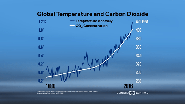
The point of departure here is the correlation of CO2 in the atmosphere (in “parts per million”, abbreviated ppm) and temperature change. The following slide shows how that looks over time. (“Temperature anomaly” just means temperature rise since the start of the industrial revolution.) The temperature rise and CO2 concentration are clearly tied closely together.
Figure 1
We can do better than Figure 1 however, just by explicitly correlating annual temperature values and CO2 concentrations. We use online data from 1959 to 2016 for the calculation, taking temperature values from here and CO2 concentrations from here.
When we plot it up, the result is a remarkably clear trendline:
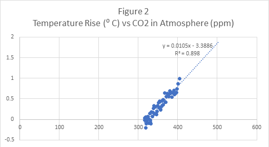
In the trendline the temperature value y (in degrees C) is related to the concentration x (in ppm) by the equation y = .0105x – 3.3886. The slope .0105 is particularly important. It says that on average whenever the ppm value increases by 1, the temperature increases by .0105 degrees Centigrade. As in the previous chart the temperature scale here shows degrees above the pre-industrial world temperature (i.e. the temperature pre-1880).
(To be clear, the linear relation between temperature and ppm is remarkably obvious in the data, but not a surprise. The temperature rise comes from reflection of infrared radiation back to earth. The probability of that happening is the probability of radiation interacting with a CO2 molecule–and that is proportional to the concentration of CO2 in the atmosphere.)
We have now have a precise statement of how CO2 concentration changes affect the temperature. The next step to see how the CO2 production affects those concentration changes. For that we need another slide as introduction.
Figure 3
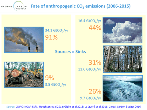
What this says is that the first thing to understand about the effect of CO2 production is how much CO2 actually ends up in the atmosphere. We’ll talk about each side of the slide separately.
The left side points out that CO2 from fossil fuel burning is only 91% of the total, because there is another factor that is completely different—deforestation and similar land use changes. For our purposes we will simply inflate our production number by 10% to get to the correct total.
The right side then points out that of the total (inflated) production number, only 44% actually stays in the atmosphere. The rest is absorbed by trees and oceans.
Hence we have the simple equation:
CO2 added to the atmosphere = CO2 produced x (1.1) x (.44). (For what follows you should know that CO2 production is reported in “gigatons”, abbreviated Gt.)
Next we need to get from gigatons of CO2 in the atmosphere to CO2 concentration in ppm. That, however, is just physics—counting molecules in the air—and it has a standard answer:
Increased CO2 concentration (in ppm) = Added CO2 (in Gt) / 7.81.
(To be precise, the reference gives the equation: extra CO2 ppm = added carbon / 2.13. To get the equation for CO2 instead of carbon, you correct for the relative atomic weights of CO2 vs carbon. Since CO2 has two oxygen atoms in addition to carbon, that means 2.13 is replaced in the formula by 2.13 x 44/12 = 7.81)
Putting the two equations together we get this simple relationship:
Increased CO2 concentration (in ppm) = CO2 produced (in Gt) x (1.1) x (.44) / 7.81. That is
Increased CO2 concentration (in ppm) = CO2 produced (in Gt) x (.0614)
Since annual CO2 production figures are also available online, we can actually verify this result using real data. The following figure gives the result (computed using rolling 5-year averages for the annual incremental ppm):
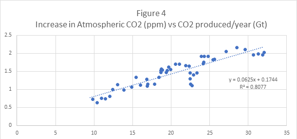
As before slope of the line is most important, because it gives the added ppm resulting from a 1 Gt of CO2 produced. In other words, .0625 is the observed value corresponding to the theoretical .0614 we just mentioned. Remarkably close given all the factors involved. (As additional confirmation, it should be noted that there are even studies based on carbon isotopes identifying the extra CO2 in the atmosphere as coming specifically from burning of fossil fuels.)
We can now put the two stages of our argument together.
We have found two results:
- For each additional Gt of CO2 produced, the concentration of CO2 in the atmosphere increases by .0614 ppm.
- For each concentration increase of 1 ppm, we get a temperature increase of .0105 degrees C.
Putting those together we get:
For each Gt of CO2 produced, the temperature can be expected to rise by .0614 x .0105 = .0006447 degrees C. You can’t get much more explicit than that.
Using that formula we can establish a baseline for climate change.
First we need to clarify that the 2 ⁰ C upper limit in Figure 2 was there for a reason. For quite some time, a 2 ⁰ C temperature increase has been regarded as a tipping point, where temperature-related changes become both serious and irreversible. For that reason the Paris Climate Agreement is targeted specifically at avoiding a temperature rise of that magnitude. (More details on the tipping point can be found here.)
First question: how much more CO2 can we emit before we hit the limit?
In stating this question we have implicitly used an important fact about CO2 that underlies much of the analysis of climate change: carbon dioxide stays in the atmosphere for decades, so long in fact that for analysis purposes we can assume it just adds up. For that reason the IPCC (“Intergovernmental Panel on Climate Change”—the key international research body for climate change) refers to a so-called “CO2 budget”. The CO2 budget is the amount of carbon dioxide you can put in the atmosphere and still stay under the 2 ⁰ C target temperature limit. The idea is that it doesn’t matter when or how you do it, that’s the budget you’ve got.
For 2016 the current world temperature was estimated to be .99 ⁰ C above the per-industrial level. Since we are at .99 ⁰ C above the pre-industrial value, we are 1.01 ⁰ C from the limit value of 2 ⁰ C.
From our final equation we have as baseline
(Gt’s to get there) x .0006447 = 1.01 degrees. So the limit is = 1.01/.0006447 = 1567 Gt’s of CO2.
Next question: How long will it take to get there at current production levels?
To answer that we need to look at the following chart of historical CO2 production levels:
Figure 5
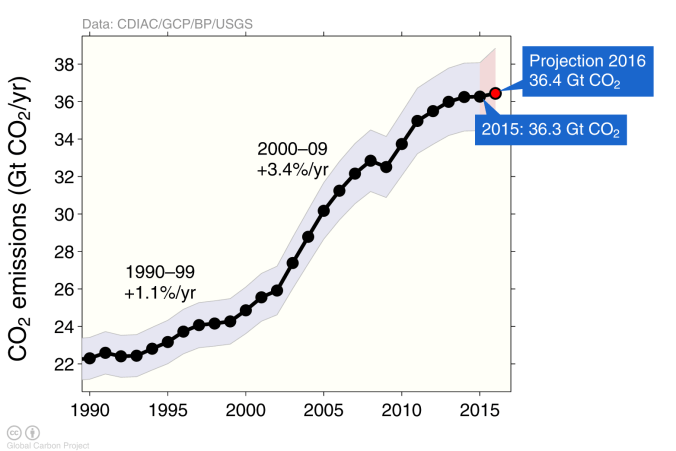
At least for now production seems to be stabilizing, so we will use the 2016 value of 36.4 Gt for the annual CO2 production. With that we get, again as baseline,
Time to 2 ⁰ C limit = 1567/36.4 = 43 years. So if nothing changes we hit disaster in 2059. (Of course avoiding disaster means acting earlier. We’ll return to that later.)
What this number means
As we’ve been careful to say, this isn’t the whole story. However what it does say is that the trend of the last 70 years is unambiguous and specific. It yields a carbon dioxide budget and a date to reckon with. Even this most straightforward calculation says we have a serious problem.
The reason that isn’t the whole story is that climate change itself has produced new phenomena that add to the baseline. Examples include
– Temperature change in the oceans
– Acidity change in the oceans
– Decline in arctic sea ice
– Melting of ice caps
– Melting of permafrost
So before we can be precise about carbon budgets and timeframes we need to incorporate the effects of these new kinds of changes, because it all adds up.
Since this is new territory, we can’t rely on history for this new piece. It requires both new science to understand the effects and new simulation models to track their interactions. That effort is the subject of the next section.
Part2 – New factors in a warming world
For the newer changes to the environment, the only way to understand the future is to learn enough to model the actual behavior. That effort is a major goal of ongoing climate science.
Then, since the effects are linked with each other, they must be tied together into a simulation model of the natural environment. Of necessity, this must include not only the atmosphere but land and water effects as well. The IPCC currently has four major simulation projects, to model scenarios with low, medium, and high levels of retained heat in the atmosphere. Those simulations are enormously complicated; they model specific per-year patterns of greenhouse gas generation in particular geographic locations with associated ocean currents, forests, glaciers, and so forth.
While the complexity of the models is beyond the scope here (see this overview for a summary), what we can do is describe some of the issues that are modeled, with an indication of ongoing work to support the results.
We should also underline the importance of this work. Because warming trends already put us in new territory, there is no history to estimate or even bound the magnitude of these new interrelated effects. Without looking in detail, we just plain don’t know what is going to happen. One sobering lesson from the longer historical record is that with climate, small changes can produce big effects.
With that as introduction, we now look at some of the important issues under study. In this we’ll see how the changes mentioned earlier actually come into play.
CO2 uptake in the oceans and on land
As we noted earlier, only 44% of the CO2 that is produced ends up in the atmosphere. The following chart shows how that has evolved over time. What gets into the atmosphere is what isn’t captured by the ocean and land sinks.
Figure 6
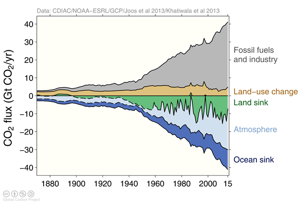
Any change in the absorptive capacity of the ocean or land sinks has a big effect on climate, by multiplying the impact of whatever carbon dioxide is produced. And there have been concerns, particularly recently, that the absorptive capacity may be reaching a saturation limit. So there is considerable ongoing work to understand the mechanisms responsible for the uptake.
For the oceans the story turns out to have several parts:
– The oceans are warming, and warmer water has less capacity for CO2. That part is relatively easy to quantify.
– A large part of the uptake, however, is due to photoplankton in the water. It turns out that there are multiple species and issues to be understood. Very significantly, the photophlankton are sensitive to the rise in acidity of the oceans. So there are a quantifiable scenarios where rising acidity will reduce the ocean uptake by killing photoplankton.
– Additionally, all of the ocean uptake involves a relatively thin layer of surface water. That upper layer is refreshed by the operation of ocean currents. As we’ll discuss in a minute, the currents themselves are vulnerable for disruption by climate change, so refresh rates will change in some scenarios.
For land sinks the story is simpler—threats to forests from rising temperatures, and new forest areas created by natural or artificial means. Note that the land sinks have been historically volatile, as you can see in Figure 6, so modeling has to be explicit and detailed.
Melting ice caps
One of the most obvious effects of climate change has been the melting of ice caps and glaciers in Greenland, Antarctica, and elsewhere. This melting contributes to warming by reducing reflectivity of ice-covered surface, but can later increase carbon uptake if the glacier is replaced by forest. Both effects are included in the models.
Glacial melting now appears to be happening faster than expected, so there is active work on the timetable. The melting also affects the salinity and therefore density of the surrounding water, which in turn can affect ocean currents. And that, as we just saw, affects ocean uptake of CO2.
It should be noted that melting of glaciers is one of the longest lasting effects of climate change. Once ice sheets begin movement toward the sea, the process becomes virtually unstoppable. Which means locking-in many meters of sea level rise in long-term projections. The Greenland ice cap alone represents 7 meters of sea level rise.
Ocean currents
Over the past few decades, it has become clear that ocean currents are linked with each other in a more comprehensive way than was understood before. The current view (the “ocean conveyer belt” or “thermohaline circulation”) is shown in the following simplified figure.
Figure 7
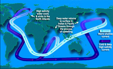
What is relatively new is the notion of deep water currents connecting surface flows—so disruption of any part of the circuit affects the flow overall.
Disruption of the circuit has many consequences. We have already seen it can affect carbon dioxide uptake by the oceans. It also affects upwelling of nutrients and hence most life in the oceans, as well as the weather worldwide.
One important special case is the down-welling in the north Atlantic, in that it appears to be affected by melting of the Greenland ice cap. That directly impacts the Gulf Stream, but the via the “conveyer belt” the effects would be felt worldwide. Details are described here.
Other greenhouse gases
Thus far we have talked only about CO2, because its residence time in the atmosphere is much longer than for other greenhouse gases, such as methane. Methane, however, is much more potent molecule-for-molecule, so there are examples where it needs to be taken specifically into account.
One such example is permafrost melting in the Asian tundra. Since permafrost is partially-decayed vegetable matter, melting of permafrost actually releases methane directly. The methane only persists in the atmosphere for about a year, but because of its potency it creates a short-term effect on climate that has been incorporated into the models.
Note that because permafrost is a phenomenon of the tundra, this is a case where the models need to react to the specific effects in particular geographic regions.
Cloud cover
Cloud cover is a surprisingly contentious subject. On one hand it is nothing new, so in that sense it is already in the baseline. On the other, it has such large potential effects both positive and negative, that it is hard to dismiss as something that might fundamentally change.
The basic arguments are straightforward: clouds reduce warming by reflecting sunlight back but they also trap heat coming from the earth. In general for high clouds the warming effect is predominant and for low clouds the cooling effect is.
There has been considerable effort to decide upon the net effect, which for now appears weakly warming.
Carbon capture
Carbon capture is a technological idea that has been around for some time without ever maturing to the point where it can be called real. The idea is that CO2 would be captured at emission or even removed from the atmosphere and either stored somewhere (underground or at the sea bottom) or handled by a biological process that would render it harmless.
Anyone who thinks the current IPCC models are deliberately alarmist should realize that the models actually include carbon capture technology starting as early as 2030. As this indicates, the models are in fact a best shot at the future and should not be thought of as a worst case.
Darken the sun
Finally, as a last item, we mention one more category of climate work that does not fit in the IPCC models. These are the speculative “if all else fails” projects. They are directed to the case where the IPCC process has failed, and the world is locked into an unlivable future. For that case they propose gases or particles to be dispersed around the earth to cut down the strength of solar radiation.
While such projects turn up occasionally in the press, all of them have very serious downsides—to start with they reduce photosynthesis and hence food production everywhere on earth—and the people working on them recognize that explicitly. It is important to realize those are not alternatives but risky and desperate measures for a future we are trying to avoid.
That ends our short summary of modeling issues.
While we have given only a few examples, it should be clear that the effects are potentially large. And we see that in the last IPCC report from 2014. (That was the 5th such report. The next one is scheduled for 2018.)
By incorporating all effects, the IPCC’s carbon dioxide budget drops to about half of the baseline–800 Gt starting from the end of 2014. That means the time to exhaust the CO2 budget is also about half—twenty years. The specific effects are described in some detail in the IPCC report itself.
Figure 8 presents the IPCC conclusions as a single key chart.
Figure 8

The chart shows that with current fuel consumption (black curve) we will get to 2 degrees C in about 20 years, but in that scenario the temperature just keeps rising afterwards. If we want to stay below 2 degrees C, we need to be cutting carbon dioxide production much sooner, about 2020 in the -4% per year scenario. Recall that since CO2 just adds up, things only stop getting worse when we are essentially done with coal, oil, and gas.
That summarizes the scientific consensus. Time is short to stay under the 2 ⁰ C limit. But as discussed in the overview post on climate change, getting there requires action but not miracles.
To end, it is worth emphasizing the importance of research going forward. There are two points:
1. The world’s climate has already changed in unprecedented ways, and we’ve had little time to understand all its new workings and dangers. This is a very complicated system, and we have perturbed it in a significant way. There are no guarantees that all changes will be gradual. The world needs the most accurate possible view of the future.
2. For the transition from fossil fuels—we’ve said we don’t need miracles. But it’s a big job to do, so the more we know the better!


